
4human HRM | User research, UI/UX design, implementation, user testing
From complexity to clarity: simplifying skill distribution and complience tracking
Role
UI/UX DesignerProduct owner (covering for a colleague)
Team
Product owner
UI/UX designer
Front-end developer
Back-end developer
QA-tester
Timeline
2024-2025
Deliverables
Workshops
User research
User flows
Specification
Redesign of existing functionality
UI/UX design
Final designs deliverables
Summary
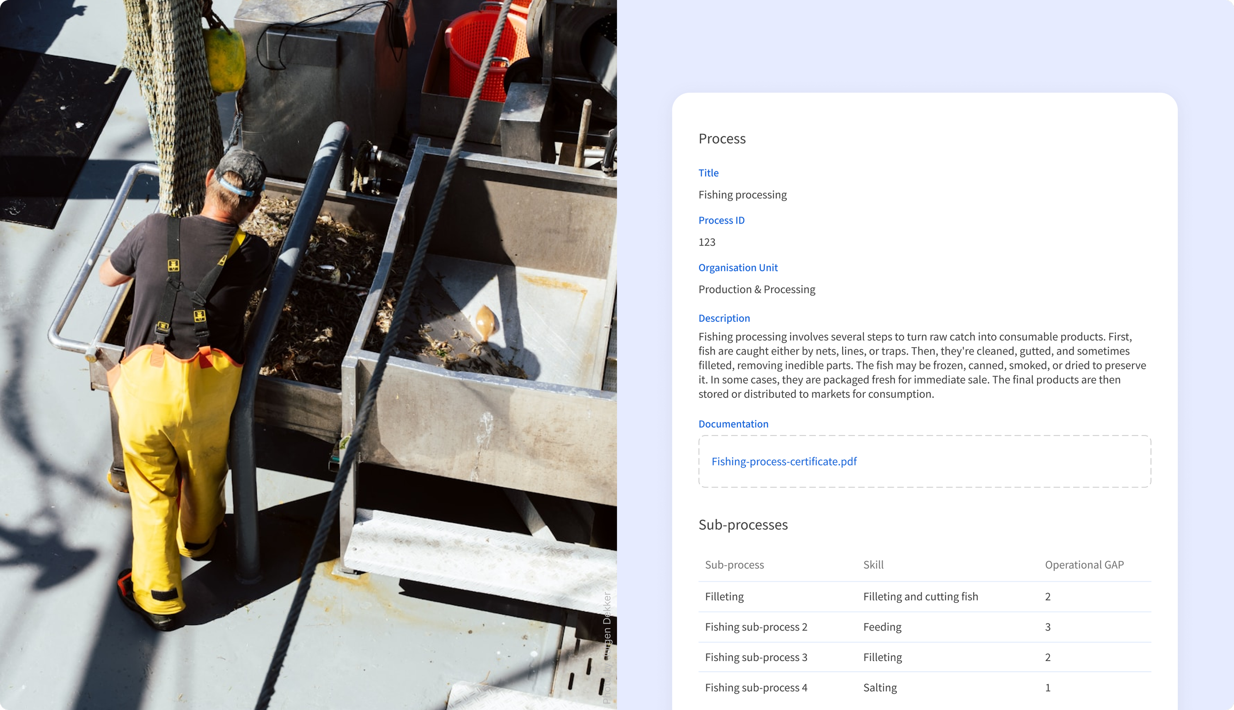
The goal of this project was to build a new module that gives companies a clear overview of critical skills across their organization. It helps teams understand whether required competencies are in place and meet internal or external compliance standards.
At the start of the project, I was responsible for shaping the initial design direction and supporting early discovery. This included understanding user needs, clarifying product requirements, and aligning design decisions with the broader product goals.
When unexpected circumstances emerged, the project was at risk of not delivering new functionality on time.
I took on additional responsibility for planning and coordination, worked closely with the Chief Product Owner, and supported the team with organizational and administrative tasks.
These efforts helped stabilize the project and ensured it was released on schedule. While the solution required further refinement after launch, the existing roadmap remained on track and was not disrupted.

Working file from Figma
Design process
I started by running customer workshops to understand how teams actually manage work processes and think about skill requirements in their daily work. The aim was to create a solution where companies could clearly define which skills were needed for specific processes and connect those requirements to their employees. The redesign of the skill matrix became a core focus, as it needed to quickly show whether the organization truly had the right skills in place.
Next, I worked closely with the Product Owner to shape user flows that reflected how users would set up processes, assign skill requirements, link them to employees, and make sense of the matrix results. We reviewed and refined these flows together with customers to ensure they matched real workflows and supported business goals. Once the direction was clear and agreed on, I translated the concepts into high-fidelity prototypes and redesigned the existing matrix to support the new functionality.
Situational risk
The project was progressing smoothly with a clear direction and regular alignment across the team. Midway through development, however, the Product Owner had to step away due to extended sick leave.
Without a clear decision-maker in place, priorities quickly became harder to manage. Open questions around feature scope, technical trade-offs, and design decisions started to accumulate, which slowed progress and introduced uncertainty. With customers already expecting delivery of the module, the project timeline was at risk, and it was unclear whether the release could move forward as planned.
My approach
Since no one was available to step in as Product Owner at that point, I took on the responsibility of keeping the project moving. I handled ongoing communication with stakeholders, helped clarify open questions around specifications, and prepared tasks so the team could continue working without unnecessary pauses.
I worked closely with developers and QA to think through workflows and make practical decisions together. To meet the deadline, we focused on delivering a solid core of the module and set aside nice-to-have features. This allowed us to release a usable product on time, while leaving space for improvements later on.
Selected visuals
Before
The matrix layout was difficult to work with, especially with large amounts of data. Users had to scroll across the screen to connect an employee's name with their skill results, losing track of which row they were on. Long skill names were displayed diagonally and often cut off, making it unclear what each column actually displayed.
After
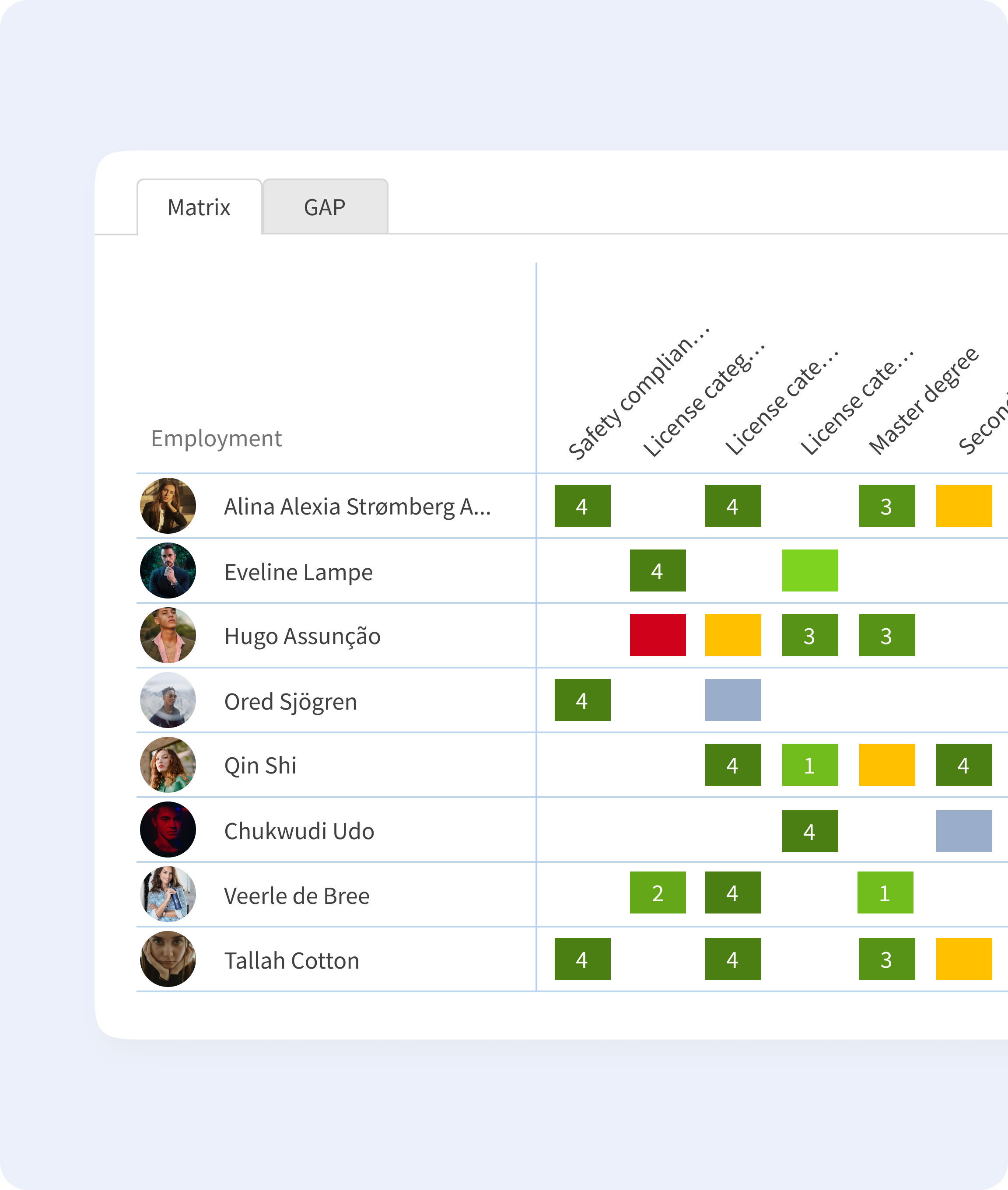
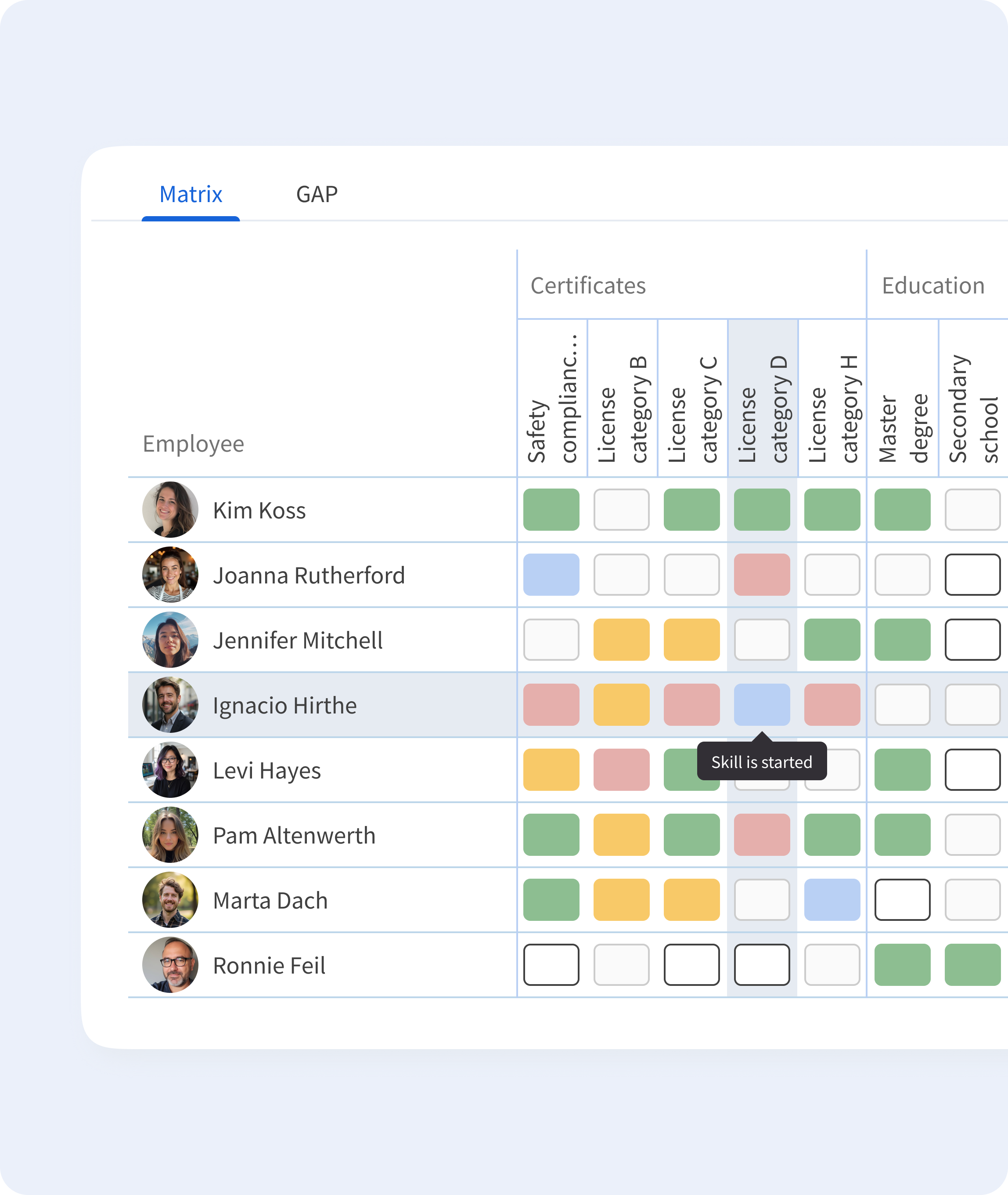
The redesigned layout uses rounded indicators and muted colors for a cleaner look. Hovering over a skill highlights the corresponding employee row and column, and tooltips provide additional context on skill status. I also introduced skill categories to group related skills, making it easier to navigate the matrix.
Making matrix readable
In the old solution, the legend consisted of a single line of rectangles hidden within a small dialog box, making it hard to understand. A legend is supposed to be a visual code that helps users read the matrix.
So I introduced a separate modal with a structured visual guide. Each color is displayed and explained individually, making it clear what it represents in terms of skill status and proficiency level. This change was positively received by both new users, just starting with the tool, and experienced users who had been using it for years, as it eliminated confusion and made interpreting the matrix faster and more accurate.

Reflection
The module launched on time and customers were able to start using it right away. It wasn’t perfect from day one, but it worked, and seeing it in use quickly showed us what needed improvement. Their feedback guided the updates we made in the following weeks.
I’m proud of what the team achieved under tricky circumstances. This experience reminded me how important clear communication, prioritizing what really matters, and working closely with the team are. It also reinforced that even when unexpected challenges pop up, thoughtful decisions and collaboration keep things moving forward.

