
Ongoing project | UX audit, UI/UX design, prototyping, user testing
Travel app: optimizing expence managment on the go
Role
UI/UX Designer
Team
Product owner
UI/UX designer (me)
Full stack engineer
Timeline
2024-now
Deliverables
Design audit
User research
Workshops
UI/UX design
Prototypes
User testing (in planning)
Summary
The 4human’s travel and expense web application was outdated and frustrating to use, especially for employees on the go. In this project, I worked closely with the Product owner and Lead developer to redesign it as a mobile-first application. Together, we identified the core features employees actually needed and stripped away functionality that only added complexity without bringing any value.
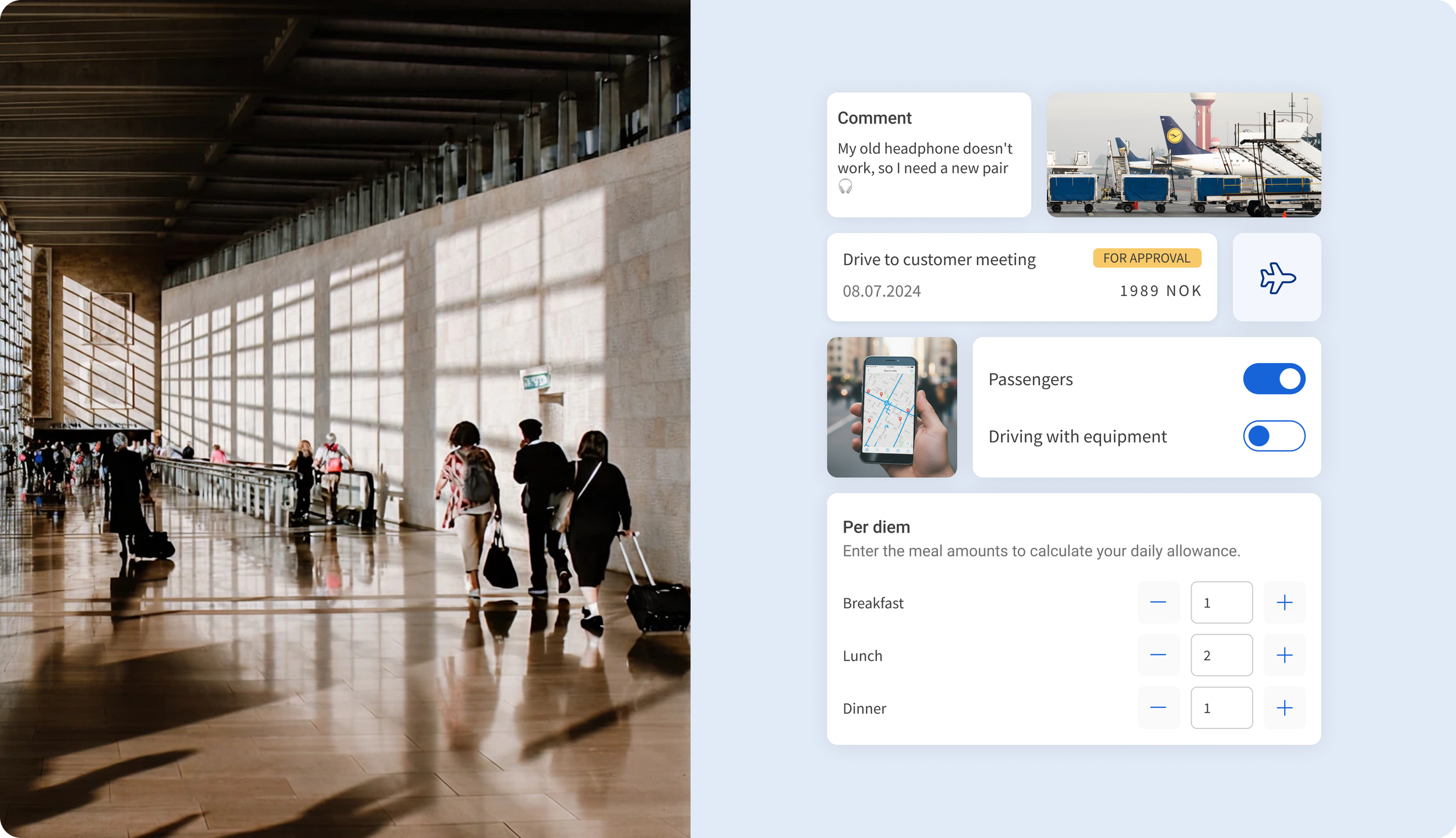
My focus was creating a simple, intuitive experience that communicates with the existing web application. The mobile experience reflects the web version but with a clear, step-by-step path for registering expenses and business trips. This means employees will be able to log expenses faster and easier while traveling and eliminate the hassle of keeping physical receipts.
Since no reliable user data was available, I prioritized real usage scenarios over assumptions to guide the design decisions. The app is currently in development, with designs completed for all core flows. Once development is finished, I plan to test it with a small pilot group of users to measure task completion time and user satisfaction before the wider release.
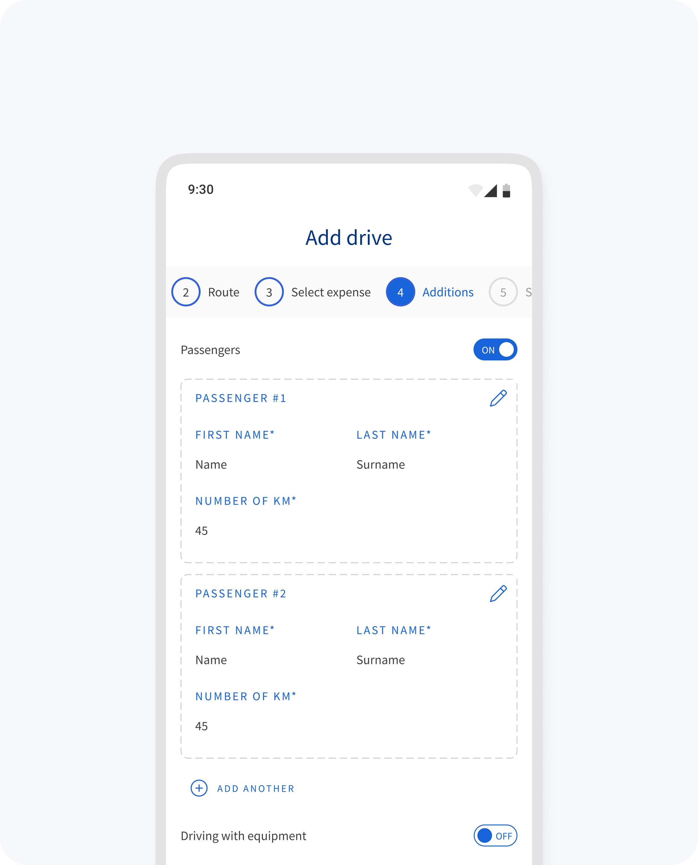
Adding passengers to registered drives
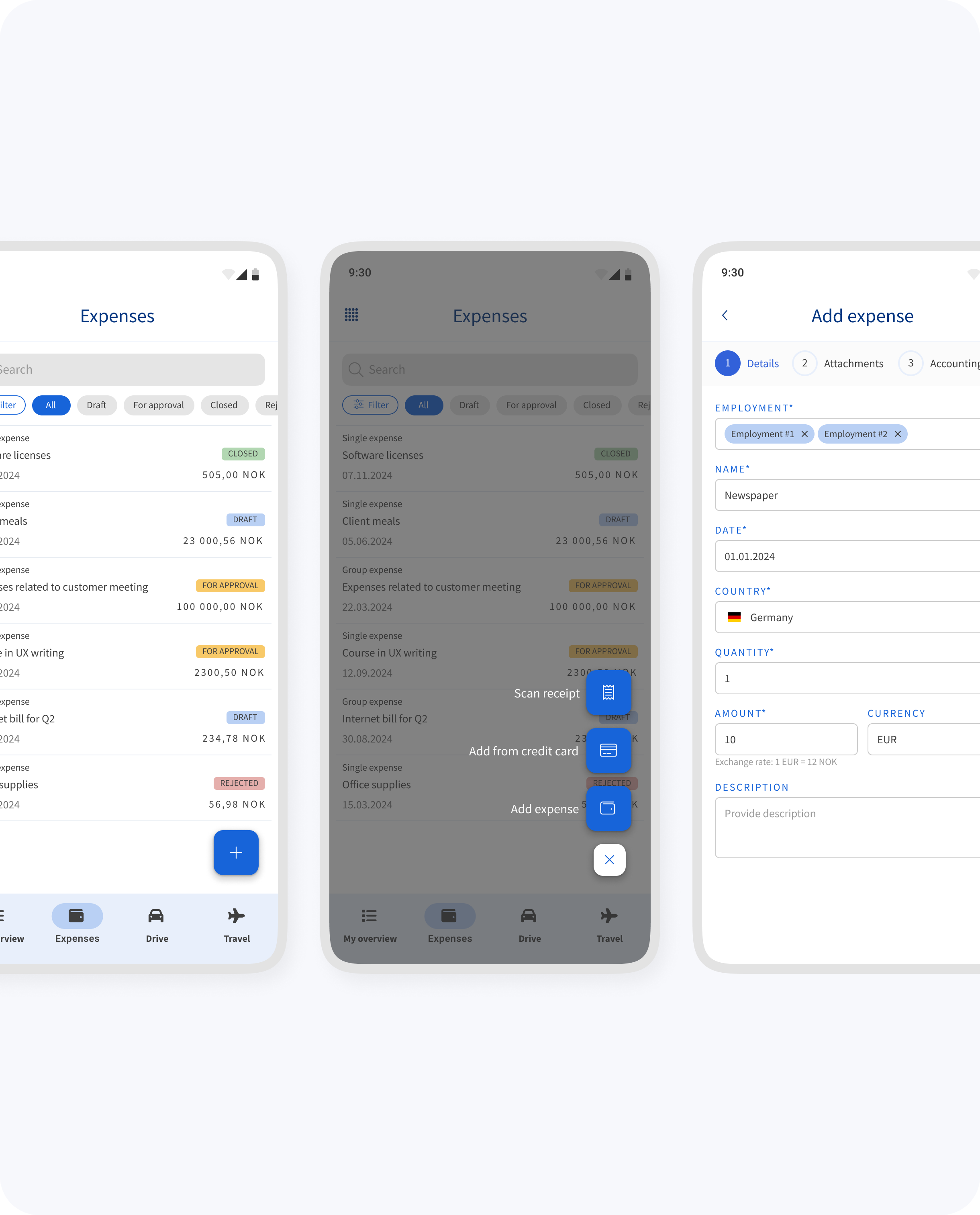
Adding expenses manually or through the OCR scanning
Problem area
The old web and mobile web versions were hard to use, especially when traveling. Employees often ended up storing receipts manually. The project also lacked clear documentation, deadlines, and direct user feedback, which made the starting point quite uncertain.
Design process
The project came with no documentation on functionality, so I started by exploring the existing web application to understand its logic and limitations. I mapped out user flows and verified them with the Product owner to ensure alignment on priorities. Working alongside the Lead developer, I defined how the mobile experience would need to differ from the web while maintaining compatibility with the legacy application.
During the project timeline, the design team was actively developing a new mobile design system, but this app needed to launch before it was ready. I had to work within the constraints of the old design framework, adapting existing web patterns where they made sense, but rethinking and optimizing them for mobile contexts where they didn't.
The first module has moved into testing, giving an early validation on these adapted patterns. The remaining modules are progressing slowely, allowing me to apply improvements from testing as we continue building out the app.

Working file with mockups from Figma
Status
The app is in active development, with all core designs delivered to the development team. Since we're working without user data, the design foundation is based on real-world usage patterns. Internal testing will be the first opportunity to validate these assumptions and see how the app performs in practice. This will be a chance to see what works, what doesn't, and where adjustments are needed. Once we gather initial feedback and make improvements, we'll test with a small group of pilot users before rolling it out more widely.
